Brand Hub

Explanation Cards

One developer concept per image: a title, one key sentence, the code that does it and one visual object.

agent.json

An explanation card teaches one concept from the docs for the ComposioDev X account or the docs themselves. The reader gets it from three things, in order: the title (the claim), the key line (what you do, what Composio does) and one visual (the code you write flowing into the one object it creates). Cards share the surface, type and seed colours of Chart Guidelines. Agents follow .claude/skills/explanation-cards/SKILL.md and render with the kit next to it.

The worked example

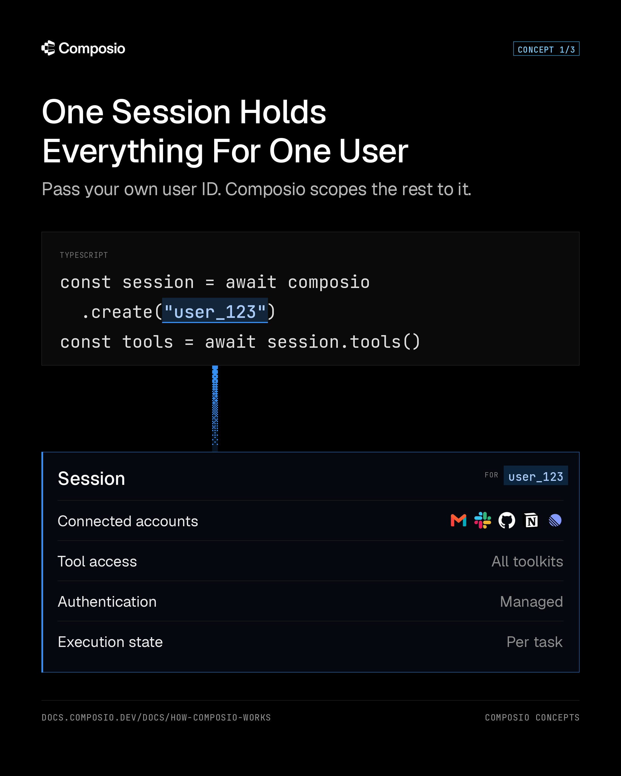
“One session holds everything for one user”, the first card in the Composio Concepts series, in both sizes. Every rule on this page came from review rounds on this card.
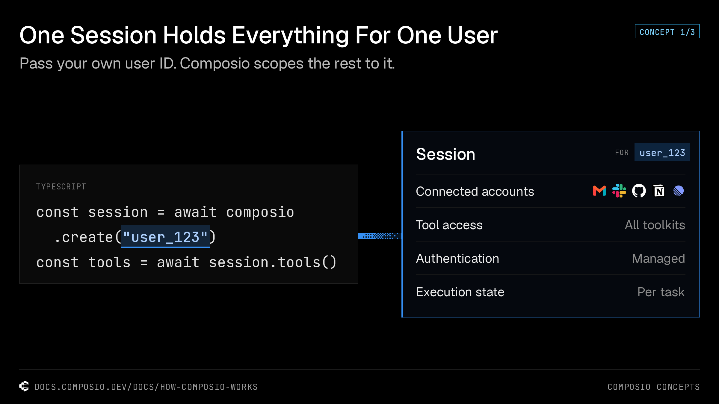
Explanation card, landscape: One session holds everything for one user
Landscape · 1200 × 675 @2x PNG
Explanation card, portrait: One session holds everything for one user
Portrait · 1080 × 1350 @2x PNG

When to make one

Use a card
One developer concept, one mechanism: a docs concept, a pattern, how a feature works. A series is fine; number it (Concept 1/3, 2/3, 3/3).
Use a chart
Numbers to compare (benchmarks, growth, pass rates). Go to Chart Guidelines and /api/chart.
Use a screenshot
A new piece of UI. Show the real product, not a drawing of it.

What good cards do

The moves that make concept cards from other developer brands work, kept as patterns rather than copied.

  • One idea per card, and the visual is the idea, not decoration around it.
  • Before and after: the old way dashed and muted, the new way solid, an arrow between.
  • One accent colour per card, used only on the thing that changed.
  • Real input shown as it is (a prompt, a user ID), not a placeholder.
  • Paths not taken faded back, so the eye lands on the chosen one.
  • A numbered series, so each card can stay small and still tell the whole story.

Anatomy

Seven parts, top to bottom. Write the words first, then the visual.

Title
The concept as a claim, 8 words or fewer. “One session holds everything for one user”, not “Sessions”.
Key line
One full sentence, two short clauses: what you do, then what Composio does. The most important line after the title.
Badge
Series position, top right. “Concept 1/3”.
Code panel
2 to 4 real, runnable lines from the docs, with exactly one value highlighted in place.
Wire
The one dither on the card, carrying the highlighted value from the code into the object.
Object
The concept as one bounded container: a header naming whose it is, then 3 to 5 rows of what it holds.
Footer
The docs URL that explains the concept, and the series name.

Layout grids

Positions are px in the card frame. Two sizes from one JSON: landscape for X posts, portrait for the feed.

Landscape · 1200 × 675

Canvas
1200 × 675, exported at 2x (2400 × 1350), pure black #000
Margins
32 on every side
Title
y 32, one line
Key line
y 88
Body band
y 160 to 589; content centred vertically in it
Code panel
x 32, width 566
Object
x 670 to 1168
Footer
y 617, 1px white/10 rule above

Portrait · 1080 × 1350

Canvas
1080 × 1350, exported at 2x (2160 × 2700), pure black #000
Margins
72 on every side
Title
y 156 and 224, two balanced lines
Key line
y 308
Code panel
y 403, full width
Object
below the wire, bottom 48 above the footer
Footer
y 1218, 1px white/10 rule above

Tokens

Surface
#000 card · #0A0A0A code panel with a white/12 outline · #05080E object fill
Accent
seed blue #358FF3. Other seeds only when a second, distinct thing must be told apart; grey #5C5C64 only for unused or other
Object edge
1px blue outline at 60% · 3px solid blue left edge
Highlight
the value in place: blue tint behind, 2px blue underline, #AACDFA text
White ladder
92 row names · 88 code · 72 key line · 60 footer and meta · 55 row values · 45 language label · 10 hairlines
Title
Geist Sans 500 · 40 landscape · 58 portrait
Key line
Geist Sans 400 · 26 landscape · 31 portrait · sentence case · white/72
Code
JetBrains Mono · 24 landscape · 30 portrait
Badge
JetBrains Mono 500 · 13 · uppercase · +0.05em · sky-400/70 border · sky-300 text
Footer
JetBrains Mono · 14 landscape · 15 portrait · uppercase · +0.05em · white/60
Dither
Bayer 4×4, thresholds (v+0.5)/16, 2px cells, solid at the origin, fading toward the target

Picking the one visual

Draw the concept as one bounded object that visibly holds its parts. Match the visual to what the concept says.

X holds, scopes or owns Y
Code panel, one wire, a container with a header and rows
Built
One call instead of many
Before panel dashed and muted, after panel solid, the wire between, accent on the part that changed
Built
X picks one path
A list of options, the chosen one in the accent, the rest faded to white 20 to 40%
Built
A flows through B to C
A left to right chain of 3 or 4 steps, one wire running through them
Built
A setting with no code
The object alone, centred, with no code panel and no wire
Built

Do and don't

Pure black #000, from Chart Guidelines.
Off-black #0F0F0F or grey grounds.
Room: margins 32 and 72, content centred in the body band.
Shrinking type to fit. Cut pills, captions and labels first.
The concept as one bounded object that visibly holds its parts.
N separate boxes the eye reads as N things.
The key line as a whole sentence in Geist, right under the title.
Half a sentence, or small uppercase mono.
Large code, with the value highlighted where it sits.
Small code, or a separate chip repeating the value.
Containers sized to their content.
Empty space above labels, or empty compartments.
Dither once, on the wire carrying the value.
A dither band per row or per item.
Real app logos where the part is real apps.
App names typed out in a row.
Row names and values in Geist; mono for code, badge, footer and tiny labels.
Mono descriptions under rows.
Geist at weight 500 or below. Two typefaces only.
Bold Geist, or a third face.

Make one

The kit renders both sizes from one JSON with Python 3 and Pillow. Fonts, marks and app logos are in kit/assets. A WARN line means the copy is too long for its slot: shorten the words, never shrink the type.

K=.claude/skills/explanation-cards/kit
python3 -m pip install pillow
cp $K/one-session.json /tmp/my-card.json   # edit the copy
python3 $K/render.py /tmp/my-card.json     # writes landscape and portrait PNGs next to it
python3 $K/render.py /tmp/my-card.json --out out/ --name concept-2
python3 $K/render.py series.json --set --out cards/   # a whole series, with checks

Every visual in the table is built. kit/examples has a JSON for each one. For a new visual, add a layout function to kit/render.py that reuses its tokens, code panel, wire and footer, and keep every rule above.

Before you hand it over

  • The title is a claim, 8 words or fewer, on one line (landscape) or two balanced lines (portrait).
  • The key line is the full sentence and reads before the code.
  • You can point at one object and say “this is the concept”.
  • The highlighted code value matches the value on the object header.
  • Exactly one dither, on the wire.
  • No WARN lines from the renderer, nothing touching an edge, no dead space in a container.
  • The code is copied from the docs and the footer URL opens the page that explains it.
  • The badge count matches the series.
  • Both sizes checked at full size and at phone size.